

Audit - Modeling Code Example Metadata
In which we decide what information to store, and how.
In this final installment in my hackathon series, let’s take a look at the MongoDB Charts I made from all the lovely data I’ve liberated from Google Sheets.
I had some ideas of what information I wanted to track, but nothing concrete. So I started out by playing with the different chart types available in MongoDB Charts.
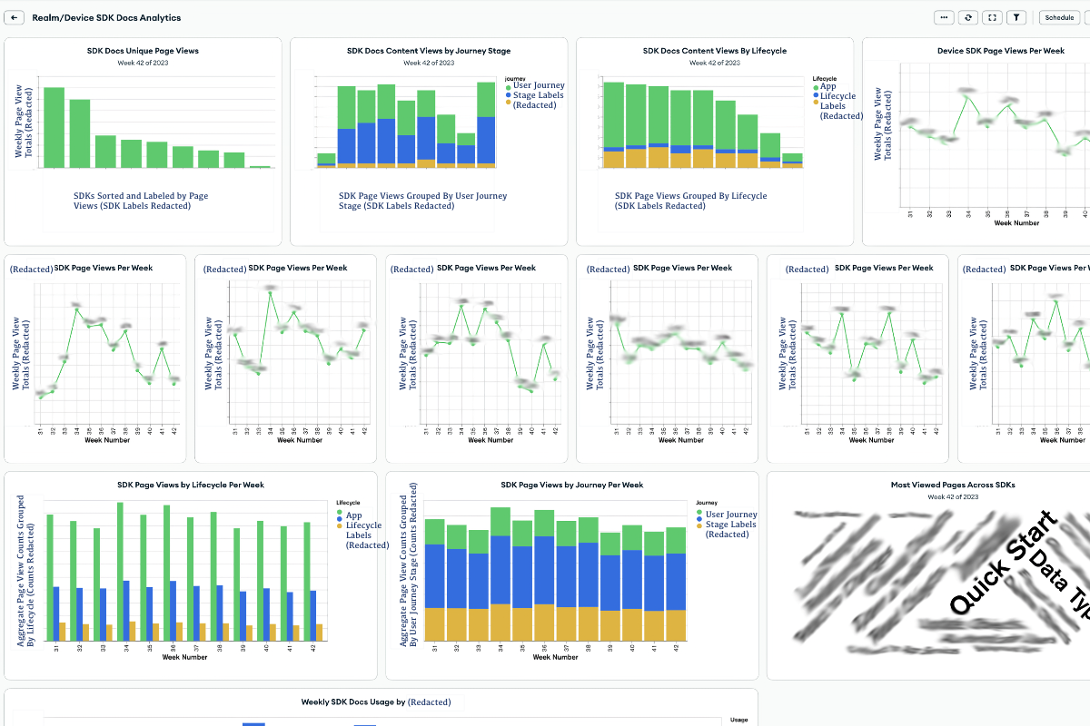
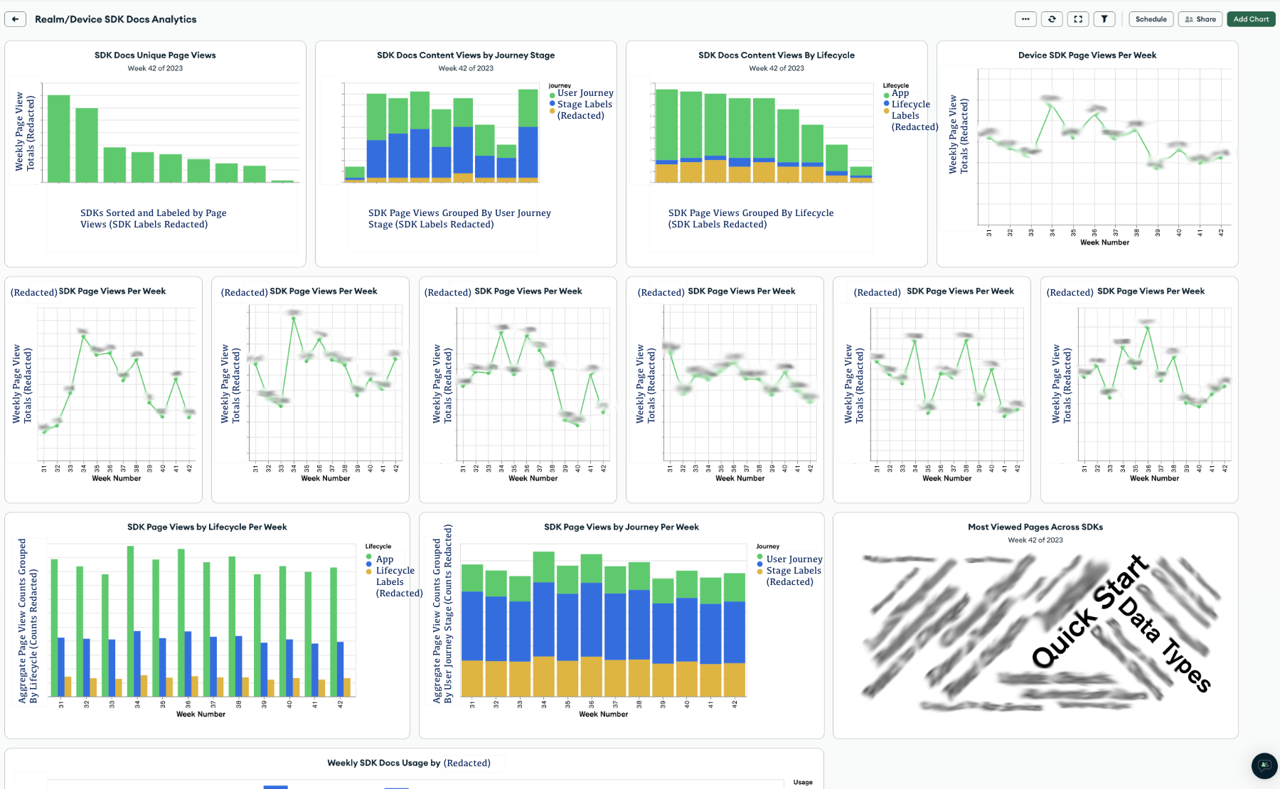
When you start a new dashboard, Charts suggests a few default charts for you. I had no real idea what I wanted, so I started experimenting with the default charts. After generating a few, I decided that my first dashboard would be an aggregate dashboard. I wanted a quick snapshot to see data about the consumption metrics of the different SDKs.
 * Note: Our company considers our analytics information protected, proprietary data. So I’ve anonymized and redacted the data here. But you can still get a sense for what the charts show, and how I set them up.*
The aggregate dashboard charts give you an overview of docs analytics across SDKs. The charts I’ve included here are:
These graphs give me the ability to visually compare performance:
I can use this dashboard to identify big-picture trends and changes in docs consumption Do all the SDKs have a dip in consumption this week, or is it just one? Is there a boost in consumption on a week when we have a big event, or when the industry is having a big event? How are the SDK docs performing relative to each other? Is one SDK supplanting another?
One more thing I want is to compare docs consumption trends to product usage data or even revenue data. I’d love to know if there is a correlation between docs consumption and product usage or revenue. But we keep those metrics in separate systems I don’t have the permissions to access, so I can’t incorporate that data into this dashboard.
I envision this dashboard being useful for:
I’d expect a team lead, tech lead, or product owner to benefit from this type of dashboard.
If the aggregate dashboard is our macro view, we need a micro view to help us make more informed decisions within the scope of an SDK’s documentation set. The micro view can help an individual writer on the team prioritize work within an SDK. It includes some of the same data as above. But I’ve also zoomed in here to view more metrics and look deeper into segments and changes over time.
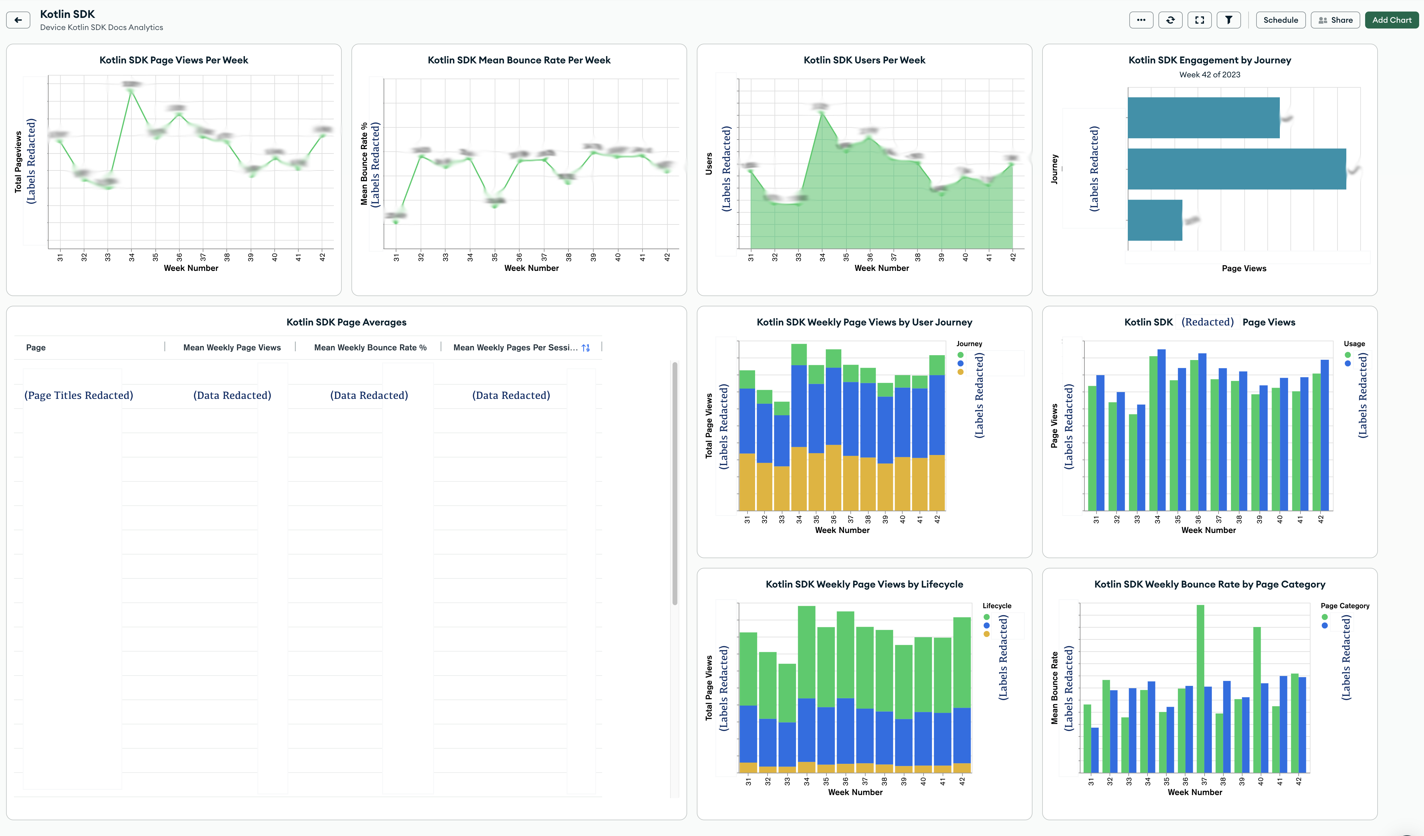
The SDK dashboard charts give the viewer a deeper dive into docs within a specific SDK. The charts I’ve included here are:
All of this is interesting data that we might use in different ways. We can identify if we are:
On an individual basis, we can identify and prioritize work using the SDK Page Averages table. Each of the columns in this table are sortable, so we can easily get the names of the pages with:
A high bounce rate could indicate a page with a technical problem, or a page whose content doesn’t match user expectations. A page with few weekly page views should get less attention than a page with a high number of weekly page views. In fact, a page with few views may be a good candidate for elimination. We should ensure highly-trafficked pages have all the content that the user needs. We should also audit popular pages more often for correctness. Pages with a high number of pages per session could indicate that the users who visit those pages are very engaged. Or it could indicate that users have to visit too many pages to answer their questions. Maybe we should consider reorganizing.
Interpreting analytics data isn’t a perfect science. But it can provide signal - especially when taken in concert with user feedback and user testing.
Having a way to assess this information gives us a hand-wavey idea of where to spend our time. It can form the basis for proactive projects and user testing.
I have only had access to these dashboards for a few weeks since hackathon at the time of writing this. I’ve already used this dashboard for several SDKs as a basis for a few projects I’m working on. I envision my teammates using this to help them prioritize their work.
The upside - or downside - of creating these dashboards is that once I saw it, I immediately wanted one for each SDK. So… I had to make 9 of them.
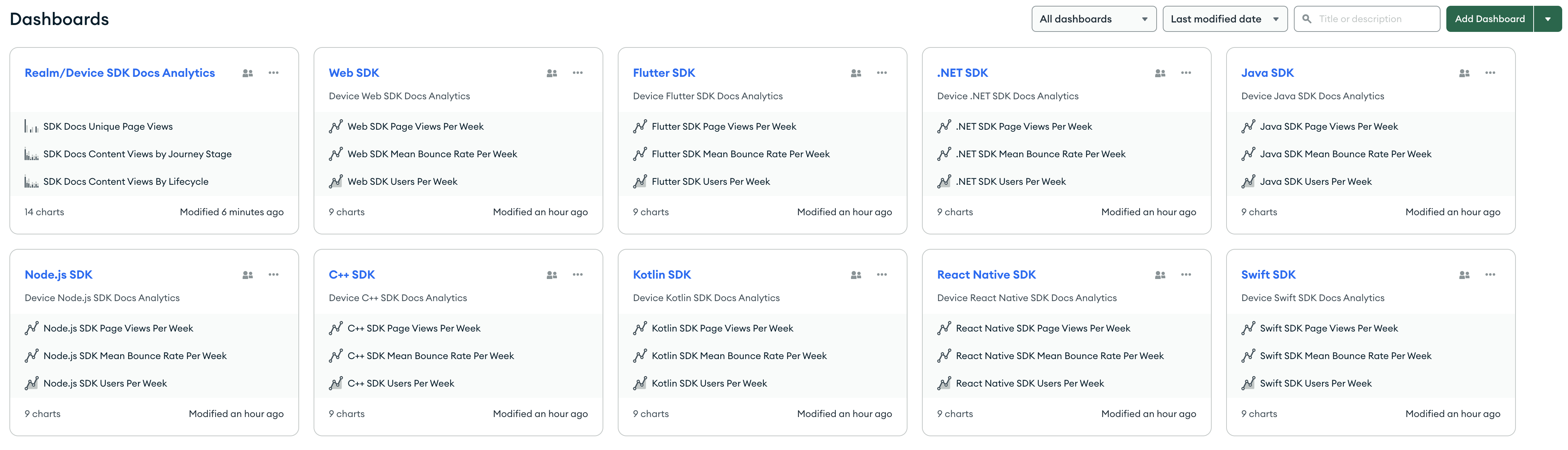
On the upside, the Charts team made it easy to duplicate a dashboard. You can click on the ... menu next to the dashboard name, and one of the options is to create a copy of the dashboard.
After creating a copy, I had to go into each chart and change the aggregations and labels for the new SDK’s values. But that wasn’t too difficult once I figured out how to build the charts.
So… how did I turn the data I shared in part 2 into the charts in these dashboards?
To display this data visually, I had to do a few things:
This was largely a process of trial and error for me. We do have some Charts tutorials and documentation for different chart types. But the examples are minimal, and I wanted to see a broader range of examples that matched the shape of my data.
I experimented until I got some charts that look correct to me. But I suspect some of my aggregations and settings aren’t quite right. In the constrained timeframe of the hackathon, I got around a day to experiment with charts. I’d love to go back and spend more time building charts and verifying correctness.
Transforming data in MongoDB is something we expect you to do with aggregation. And happily, our Charts support aggregation pipelines! If your data has a simple structure, you can create a basic query for your charts. But I ended up using aggregation stages in almost my charts to get the data into the right structure to visualize it.
It’s worth noting that Charts provides some common aggregation operations in the UI. You don’t have to know aggregation and build pipelines manually. But when I had flaws in my understanding, the errors in the UI weren’t that helpful. I found it easier to experiment with pipelines in Compass and the Atlas Aggregation UI. I could see sample documents with my output, and make sure the data seemed correct.
Helpfully, the Charts UI gives you the ability to save and load queries and pipelines. Once I figured out the shape of my aggregation pipelines, I could save them and use them again to create new charts.
To give you a few examples:
In the aggregate dashboard, the first chart is a grouped column chart that shows SDK docs unique page views grouped by SDK for a specific week. The aggregation to create this chart is:
[
  {
    $match: {
      product: "Device SDK"
    }
  },
  {
    $unwind: {
      path: "$weekly_data",
      preserveNullAndEmptyArrays: false
    }
  },
  {
    $match: {
      "weekly_data.week_number": 42
    }
  },
  {
    $group: {
      _id: {
        sdk: "$sdk"
      },
      total_pageviews: {
        $sum: "$weekly_data.unique_pageviews"
      }
    }
  }
]
This aggregation does a few things:
$match stage filters for only documentation pages for “Device SDK”. This excludes Realm Studio and other docs pages in this documentation set.$unwind stage deconstructs the weekly_data array field in each document that passed the first filter. It outputs a document for each element in the array - so each weekly_data row becomes its own document.$match stage filters for only documents matching the desired week - in my example, that’s week 42. It throws out all the other weekly_data array documents we created with the unwind stage.$group stage does two things:
sdk field. In this case, that value is the name of one of our 9 SDKs. This groups all the documents with weekly data values for the C++ SDK, for example, together with the ID “C++ SDK”.total_pageviews field that is the sum of the value of the weekly_data.unique_pageviews field for all the documents grouped by the SDK ID. In this example, we would have 9 total_pageviews values - one for each SDK.In the aggregate dashboard, the second chart is a stacked column chart that shows SDK docs unique page views grouped by SDK and user journey stage for a specific week.
[
  {
    $match: {
      product: "Device SDK"
    }
  },
  {
    $unwind: {
      path: "$weekly_data",
      preserveNullAndEmptyArrays: false
    }
  },
  {
    $match: {
      "weekly_data.week_number": 42
    }
  },
  {
    $group: {
      _id: {
        sdk: "$sdk",
        journey: "$journey"
      },
      total_pageviews: {
        $sum: "$weekly_data.unique_pageviews"
      }
    }
  }
]
This is almost exactly the same as the aggregation above, with one exception. In the $group stage, I’m grouping on two IDs:
sdk field, which is the name of one of our 9 SDKsjourney field, which is one of three user journey stages.So instead of having just 9 sums at the end of the pipeline - one for each SDK - I have 27 sums - one for each SDK for each user journey stage.
The SDK dashboard has a data table text chart in the bottom left quadrant of the dashboard. This table is sortable on the column values. It has proven to be a surprise standout in quickly providing useful data for us.
The aggregation for this table is very simple:
[
  {
    $match: {
      "sdk": "Kotlin SDK"
    }
  },
  {
    $unwind: {
      path: "$weekly_data",
      preserveNullAndEmptyArrays: false
    }
  }
]
All I’m doing here is matching on a specific SDK, and unwinding the weekly_data arrays for that SDK. In this case, the chart itself is doing a lot of the useful work.
Once I had the data in the right shape, I had to arrange that data in the chart in a way that actually made sense. In my trial and error, I did a lot of inverting the X and Y axis. I spent time fiddling around trying to figure out grouping, binning, and series. Once I had those tools, though, I was able to quickly produce useful charts. I have no doubt I could do a lot more powerful things than I’ve done here if I had more time to play with this.
Taking the same three charts above, here’s what I customized to get the visual output you see in the redacted screenshots:
With the aggregation I specified above, I only have two fields to use in this chart:
sdktotal_pageviewsBelieve it or not, I still managed to use them on the wrong axes the first time around. I don’t do a lot of graphing these days. But swapping those values makes a lot more sense.
sdk sorted by VALUEtotal_pageviews with an aggregate sumI excluded Null/Missing and Empty String values from the sdk grouping. I overrode the snake case field names with human-readable label values.
It took me a bit to figure out how to get these 27 sums from my aggregation to display in a stacked column graph.
In this case, I have three fields I can use in this chart:
sdkjourneytotal_pageviewsAfter some experimentation, I realized I needed to use them in this way:
sdk sorted by VALUEtotal_pageviews with an aggregate sumjourneyFiguring out that I needed to use the journey ID in the Series spot was what I was initially missing. But I got the nice stacked view after I got this missing detail.
I excluded Null/Missing and Empty String values from both the sdk grouping and the journey grouping. I overrode the snake case field names with human-readable label values.
This was a fun one, because the table chart type actually does a lot of the work for you. All I had to do was select the fields I wanted to display on the chart.
For this chart, defining the Groups value was easy. I wanted to group the chart values by the page title, so I added page as the group.
For the values, I thought it might be useful for us to be able to view a few key metrics on this table. I was able to drag fields from the weekly_data array directly into the table. The fields I chose were:
unique_pageviewsbounce_ratepages_per_sessionI could add more columns, but that made the width of the table wider than the area I wanted to allocate for it. I chose to stop with just these fields. If we want more data as we use this table, we can always add it.
For each field, I had to decide how I wanted to aggregate the values. I chose to use the mean of the values across all the weekly data. This would give us a good snapshot of each page’s performance to date. It might be nice to view changes to page performance over time, but this isn’t the right type of chart for that visualization.
For customizations, I overrode the snake case field names in the labels with human-readable values. I excluded Null/Missing and Empty String values from the page grouping.
Alright, so now that I’ve got the charts, how do I update them? They’re only useful if they can answer my questions at the moment in time I need to ask them. But with 9 SDK dashboards and an aggregate dashboard, would it be a ridiculous amount of work to update them?
Short answer: not as much as you might think. The beauty of Charts is that they’re based on the data that’s in Atlas. The charts update periodically based on updates to the linked data source. So when I add a new week’s worth of data to the Atlas collection from my Google Sheet using my Google Apps Script -> HTTPS Endpoint -> Function pipeline, the charts in my dashboards automatically update to show the new week’s worth of data.
There are only two places where I need to do this manually:
$match stage. In the examples I’ve shown in this article, that is all of the “Weekly Page Views per…” charts. It would be awesome if there were a latest variable, or some other way I could indicate that I wanted to dynamically update this aggregation. Or even a variable I could specify/update once for the dashboard and use it in many charts. I’d create a week variable and would just update that to the current week.Overall, the places where I must make these changes manually are only in a few charts. Mostly in the aggregate dashboard, but there is one chart in the SDK dashboard where this applies. So far, since the hackathon week, I have been manually updating the aggregate dashboard charts most weeks. But I have only updated the SDK-specific dashboard when I am viewing the dashboard for a specific SDK.
Data exists for us to use it. It’s only useful as it is able to answer our questions and help us achieve some objective. I’m willing to draw a radical line in the sand here and assert that in most cases, Google Sheets is where data goes to die.
Yes, you can control who can access a Google Sheets - sheet? - pretty easily, and you can easily add and change data in it. But if you need to do complex data manipulation across tabs or across sheets, it is not an optimal experience. And while you can create charts in Google Sheets, it’s more of an - afterthought? Add-on? You have to just sort of paste them on top of a sheet. And while you can do some degree of automatic updates with formulas, it’s much more simplified than what is possible with something like MongoDB Atlas/Charts.
Ultimately, it’s in our nature to reach for the tools we know to complete our tasks. It’s faster to do something with a tool you already know than to learn a new toolchain. I’m half joking when I cast shade at Google Sheets. I used Excel as a database for many years before I got into programming, because that’s what I knew. And I recognize that for many of us, we don’t have time in our day jobs to go out and learn something new unless we have to.
But let me tell you - now that I have these Charts dashboards, I never want to go back to the Google Sheets. I’ll use them as an intermediary tool to get the data that someone else gives me out of some other data source and into Atlas. And then I won’t look back. I hope I can share the value with my teammates and stakeholders. I look forward to building new charts and dashboards as we link up more data sources and learn to ask better questions from our data.
In which we decide what information to store, and how.
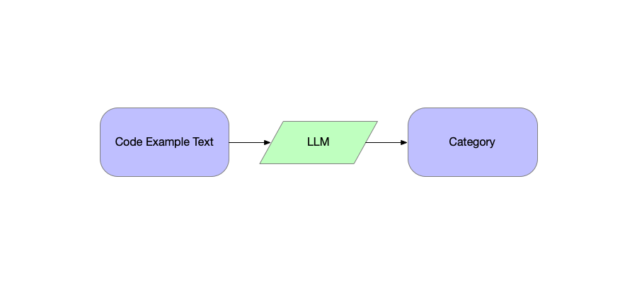
In which we have an LLM help us assign categories to code examples.
In which we explore the best way to get content and work with audit data.